Form designer
The form designer is a built-in visual tool for designing mnemonics and binding data (data source tags) to them on Webdata.live.
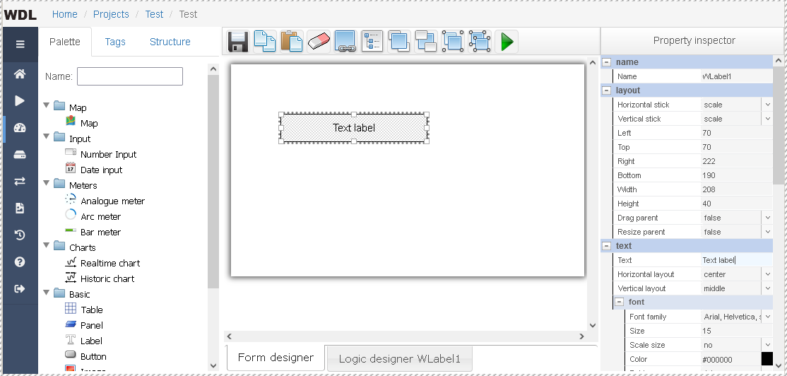
Interface description
In the central part there is an empty form (basic component) - the future mnemonic. It is proposed to place a set of visual elements on the form in the same form in which it will be displayed to a user (wysiwig). In the designer, you can copy/paste/delete standard components/custom templates, move and edit component properties.
There are three tabs on the left side.
- "Palette" - a repository of ready-made components that can be used on the form, divided into groups.
- "Tags" - a tree structure of data sources and tags of data sources available for the project.
- "Structure" - a tree-like list of components used on the form.
On the right side is the "property inspector", which displays the properties of the selected component on the form (or common properties, if several components are selected at the same time).
Above the form is the designer toolbar, with the following functions:
- Save the form (on the server)
- Copy the selected components to the clipboard (to the server) (shortcut Ctrl+C)
- Paste the copied component from the buffer (server) (key combination Ctrl + V)
- Delete selected components (Del key)
- Create a template from a component/group
- Manage templates
- Bring selected components to front
- Move selected components to back
- Group selected components
- Ungroup selected components
- Form preview in run mode
Overview of visual components
The palette includes a set of components for displaying and structuring data:
- Form - the form, the main container in which all other child components are located
- Panel - panel, allows you to contain child components
- Label - text label, displays a text label
- Image - image, displays a picture
- Button, Image Button - a button, a button with an image, you can attach an action to buttons
- Table - a table is needed to structure data in a tabular form
Advanced Components
- Map - map for displaying geographic data, may contain markers and child components
- Number input - to enter numerical data from the user
- Date input - to enter date/time range from user
- Analogue meter, Arc meter, Bar meter - indicators that display analog value graphically
- Historic chart, Realtime chart - to display historical charts and realtime charts
- Smart busbar - to display buses and pipelines
- Events log - to display the event log
In addition, the palette can be expanded with your own components (templates), your templates are available on the "User templates" node.
Adding a component from the palette
Option 1. It is necessary to select the name of the component in the palette and drag-n-drop it into the form area with the mouse. During dragging, the component that the mouse cursor is over and that the child component can receive is highlighted with a frame: a green frame indicates that the child component can be received, a red frame indicates that the child component cannot be received (the child component is larger than the one that accepts). After releasing the mouse button, the component will be created in the place where the cursor was at the moment the mouse button was released. It will have standard sizes.
Option 2. It is necessary to select the name of the component in the palette so that it is highlighted. Then, on a component that can contain a child component, hold down the left mouse button, draw an area (frame) and release the mouse button. The new component will be created and will have the dimensions of the drawn area.
Selection of components
After the component is added, it is automatically selected - it has an additional frame, the background changes and "handles" for resizing appear. If you click on another component, for example, on the main form, then it will also be selected, but the selection from the first component will disappear. You can select multiple components by holding down the Shift key while clicking on the next unselected component. Also, you can deselect one of the already selected components by clicking on it with the Shift key pressed. You can also select components by clicking on the corresponding names in the "structure" with the mouse.
If you click on the selected component on the form while holding down the Ctrl key, the underlying component will be selected. If you click on the selected component while holding down the Alt key, the overlying component will be selected.
Pressing Ctrl+A allows you to select all immediate child components of the currently selected components, while deselecting the parent components. If you press Ctrl+A while holding down the Shift key, then the selection from the parent components will not be removed.
Component properties
Components contain a set of properties that can be modified in design mode. A number of basic properties are presented on this page. In addition, components can have dynamic properties, predefined user behavior that is part of the component, in which properties can change at runtime.
Property Inspector
The Property inspector displays the properties of the selected component. If multiple components are selected, the Property inspector will display only the common properties: identical common property values will be displayed, and different common property values will be blank. You can change some properties in the inspector and they will immediately be applied to the selected objects.
Changes are not saved automatically, but are applied only in the current window, i.e. in order for the changes not to disappear and become available from another browser, you must click on the save button in the toolbar (with the image of a floppy disk). Also, you can see how the form will look in the "working mode" - for this you need to press the button with the green arrow (run), while saving the current form is not necessary.