Form designer: visual components Realtime chart, Historic chart
The Realtime chart and Historic chart components are designed to display graphs of data coming from data sources.
Realtime chart component - displays data coming in real time. Initially, the chart is empty, but with the arrival of new data, it is added to the chart. The data for the last configured amount of time is displayed. Older data is removed from the chart. Because new data may not come from the data source, if it remains unchanged, then for convenience, an optional function is provided for adding fake points that duplicate the old ones in value periodically.
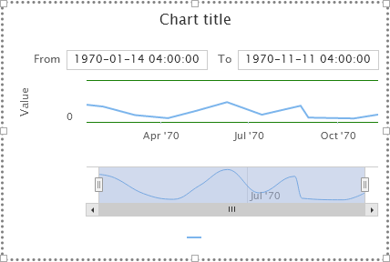
Historic chart component - displays data stored on the Webdata.live database servers. When new data arrives, it is not automatically updated on the chart, but the data can be examined by selecting the period of interest to display.
Components allow you to display multiple series of data at the same time. In this case, two data series can either be on a same or on a different Y axes.
Both components are very similar in setup:
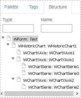
If you put them on the form and look into the structure, you can see that:
- Chart display components have one X-axis - ChartXAxis child component
- one by default, but there may be several Y-axes - child components of ChartYAxis
- on each Y-axis, by default, there is one, but there may be several series that are responsible for the displayed data - they are represented by the ChartSerie child components of ChartYAxis.
- on each Y-axis, by default, there is one, but there may be several series that are responsible for the displayed data - they are represented by the ChartSerie child components of ChartYAxis.
HistoricChart/RealtimeChart component properties
The main properties are combined in the "chart" group:
- "chart".
Chart title- chart title - "chart".
Show legend- show/hide the legend - "chart".
Show export button- show a button that allows you to export visible data (in png, csv, xls format) - "chart".
Amount of Y Axis- the number of Y axes. Changing the parameter adds or removes the Y axes from the chart (and their series with them) - "chart".
Input enabled- only for HistoricChart - show or hide fields for entering date range - "chart".
Hide reset zoom- only for HistoricChart - allows you to disable the display of the "Restore zoom" button
Properties related to the "tooltip", which displays values when hovering over series points, for a chart:
- "tooltip".
Enabled- enable or disable tooltips - "tooltip".
Position- location for tooltip- "auto" - automatically selected, next to the cursor
- "top left","top right","bottom left","bottom right" - in one of the specified corners of the component
- "tooltip".
Border color- tooltip frame color - "tooltip".
Border radius- border radius of a tooltip (in percent) - "tooltip".
Border width- tooltip border width (in pixels) - "tooltip".
Shadow- whether to cast a shadow for the tooltip frame - "tooltip".
Hide delay- tooltip will hide after this time (ms)
Properties of the axes components, - ChartXAxis, ChartYAxis
The ChartXAxis and ChartYAxis properties are very similar, all of the following properties apply to both of them, with a few exceptions which will be mentioned later. All the main properties of the axes are collected in the "axis" group:
- "axis".
Crosshair- whether to display a crosshair that will follow the mouse pointer - "axis".
Line color- axis line color - "axis".
Line width- axis line width - "axis".
Offset mode- axis offset mode from the chart area, automatic "auto" or manual "manual" - "axis".
Offset- offset (in pixels) from the axis to the plot area, if the manual offset mode is used - "axis".
Opposite- by default, the Y-axis is located on the left of the chart, the X-axis is on the bottom of the chart. This parameter allows you to change the standard side of the axis position if you set the value to "true" - "axis".
Reverse- by default, values increase from bottom to top on the Y axis, and from left to right on the X axis. This parameter allows you to flip the direction of the axis, if you set the value to "true" - "axis".
Visible- The property allows to hide ("false") or show the axis ("true"). Axis is visible by default
The properties of the subgroup "axis"."gridline" set the parameters for displaying grid lines. There are primary and minor grid lines. Grid lines are drawn on the plotting area and the primary ones start from the main ticks, the secondary ones start from the secondary ticks:
- "axis"."gridline".
Color- color of primary grid lines - "axis"."gridline".
Dash style- drawing style of the primary lines: more than 10 different options, from solid to dash-dot types - "axis"."gridline".
Width- thickness of primary lines drawing
the same parameters in this group, with the prefix "Minor" in the property name - refer to the rendering of minor grid lines
The properties of the "axis"."ticks" subgroup set the parameters for displaying tick marks on the axis. Ticks can be major and minor.
- "axis"."ticks".
Color- color for drawing major ticks - "axis"."ticks".
Interval mode- Sets the interval mode for drawing tick marks, either "auto" or "manual" - "axis"."ticks".
Interval- If manual interval mode is selected for drawing ticks , then this parameter sets the interval of ticks - "axis"."ticks".
Position- position of ticks relative to the axis, either "outside" or "inside" - "axis"."ticks".
Width- width of ticks - "axis"."ticks".
Length- length of ticks
the same parameters in this group, with the prefix "Minor" in the property name - refer to the rendering of minor ticks
The properties of the subgroup "axis"."ticks labels" set the parameters for displaying the labels of the values of the main ticks of the axis:
- "axis"."ticks labels".
Enabled- allows "true" or disables "false" display of axis tick values - "axis"."ticks labels".
Align- aligns labels to the "left", "right" or "center" - "axis"."ticks labels".
X Y Mode- alignment of labels relative to tick marks either "auto" (by default) or "manual" - "axis"."ticks labels".
X- sets the horizontal offset of the label by the specified value (pixels), if the manual mode for aligning tick labels is selected - "axis"."ticks labels".
Y- sets the vertical offset of the label by the specified value (pixels), if the manual mode for aligning tick labels is selected - "axis"."ticks labels".
Format- allows you to set the formatting for displaying the values of the main ticks of the axis. Empty by default, you can specify some format, for example {value:.1f} - for a fixed output of 1 decimal place - "axis"."ticks labels".
Rotation- allows you to rotate the labels by the specified angle (in degrees). Default 0 - "axis"."ticks labels".
Step- step for displaying labels. The default value is 1 - i.e. each major tick will have a value. If you put 2 here, then only every second major tick will have a value
The properties of the "axis"."title" subgroup set the parameters for displaying the axis title:
- "axis"."title".
Align- alignment of the text with the axis title relative to the axis: possible values: "low" - closer to the origin, "middle" - in the middle of the axis, "high" - closer to the end of the axis - "axis"."title".
Margin- you can control the offset of the axis label from the axis (in pixels) - "axis"."title".
Rotation- you can control the rotation angle of the axis label (in degrees), for the Y axis it is 270 by default, and for the X axes it is 0 - "axis"."title".
Title- axis title text
Specific properties of the ChartYAxis component
-"axis".Amount of series - controls the number of child ChartSerie components, which are responsible for setting the data series output to this axis
-"axis".Min-Max mode - minimum and maximum value mode. The default is "auto" - i.e. the axis is automatically scaled according to the displayed values. If you put "manual" then in the "axis".Min and "axis".Max parameters you can set the scale manually by specifying the minimum and maximum values for the axis.
"bands" property group - combines settings for displaying colored bands passing through the plotting area and denoting ranges of axis values:
- "bands".
Plot bands num- parameter sets the number of groups of "band" settings. Up to 8 groups can be specified.
Parameters of each group:
- "bands"."band N".
Border color- band border color - "bands"."band N".
Border width- thickness of the band border - "bands"."band N".
Color- band background color - "bands"."band N".
From- the value of the beginning of the range on the Y axis - "bands"."band N".
To- the value of the end of the range on the Y axis
Specific properties of the ChartXAxis component for RealtimeChart:
- "axis".
Window in sec- trends for the last specified number of seconds will be displayed - "axis".
Force interval sec- the interval for adding fake points, for a case when there is no new data from the data source,
seconds
Specific properties of the ChartXAxis component for HistoricChart:
Settings group "axis"."interval" - sets the initial date range for display
- "axis"."interval".
Interval type- interval type, either "relative", or "fixed"
if a fixed interval type is specified:
- "axis"."interval".
Time start- string with start time - "axis"."interval".
End start- string with end time
if the relative type of the interval is set, you need to adjust the type of time units, the number of units, how to count the units.
- "axis"."interval".
Time unit- type of time unit: you can choose from a second to a year: "second", "minute", "hour", " day", "week", "month", "quarter", "year" - "axis"."interval".
Unit- indicates the number of selected time units - "axis"."interval".
Count from- sets the rule for calculating the initial moment of time using the selected time unit. The end point in time is obtained by counting back from the initial specified number of selected time units:- "current moment" - start date is the current moment (with time)
- "begin of current" - start date is date and time of the currently selected time unit (for example, if a day is selected, the start date will be 0 hours 0 minutes 0 seconds of the current day)
- "end of current" - start date is the end date and time of the currently selected time unit (for example, if a day is selected, then the start date will be the end of the current day)
ChartSerie component settings
The main setting of the ChartSerie component is in the "tag" group and allows you to bind data to a chart
- "tag".
Data source- name of available data source - "tag".
Device- device name inside the data source - "tag".
Tag name- tag name inside data source device
All other series settings affect the display details of the series.
"serie".
Serie type- series type, data display as:- "line" - regular line
- "spline" - smoothed line
- "column" - set of columns
- "area" - area
- "areaspline" - smoothed area
"serie".
Allow point select- whether to allow the user to select points - "false" or "true"- "serie".
Color- series line color - "serie".
Dash style- series line drawing style: more than 10 different options, from solid to dash-dot types - "serie".
Enable mouse tracking- allows you to disable or enable mouse response to display tooltips. It can be useful to turn it off when displaying a lot of data to improve the responsiveness of the interface. - "serie".
Line width- series line drawing width (in pixels) "serie".
Symbol- the shape of the marker that will be displayed in place of the points of the series if there is enough space to display- ""(empty) - autoselection
- "circle" - circles are displayed
- "square" - squares are displayed
- "diamond" - diamonds are displayed
- "triangle" - triangles are displayed
- "triangle-down" - triangles are displayed, cone down
"serie".
Name- The name of the series that is displayed in the legend- "serie".
Shadow- if "true", then the series will cast a shadow - "serie".
Show in legend- if "true", it will be displayed in the legend - "serie".
Visible- if "true", then the series will be visible, otherwise hidden
The "serie"."data labels" group combines properties for drawing labels with values above the series points in the plotting area:
- "serie"."data labels".
Enabled- value "true" - labels with values will be drawn - "serie"."data labels".
Align- label alignment relative to the point, center/left/right - "serie"."data labels".
Background color- background color of the label with text - "serie"."data labels".
Border color- label frame color with text - "serie"."data labels".
Border radius- number-percentage of roundness of the frame with the label - "serie"."data labels".
Border width- thickness of the label frame with the value (in pixels) - "serie"."data labels".
Color- text font color with values - "serie"."data labels".
Format- output format. e.g. {y:.2f} - displays 2 decimal places - "serie"."data labels".
Shape- shape of labels background - circles/squares/diamonds/triangles - "serie"."data labels".
X- horizontal offset of the label to the point (in pixels) - "serie"."data labels".
Y- vertical offset of the label to the point (in pixels)
"serie"."marker usual", "serie"."marker hovered", "serie"."marker selected" property groups - determine the presence and appearance of the series "markers" - how the graph points will look in three states: "marker usual" - in the normal state, "marker hovered" - in the state when the mouse cursor is over the point, "marker selected" - when the user clicked on the marker. in each group, the set of properties is as follows:
- "serie"."marker".
Enabled- enables or disables the display of the marker symbol for the series - "serie"."marker".
Fill color- background color of marker symbol - "serie"."marker".
Line color- border color around marker character - "serie"."marker".
Line width- width of the border around the marker character (in pixels) - "serie"."marker".
Radius- marker radius (in pixels)
The group of properties "serie"."tooltip" combines the properties of the tooltip that occurs at the points next to the mouse cursor:
- "serie"."tooltip".
Value decimals- the number of decimal places after the decimal separator of the value - "serie"."tooltip".
Value prefix- prefix string (what will be before the value) in the tooltip - "serie"."tooltip".
Value suffix- suffix string (what will be after the value) in tooltip - "serie"."tooltip".
Date format- date format in the tooltip, for example, you can enter the values %Y-%m-%d, to display only the date without the time