Form designer: Basic visual components
Form
Form is the main container that contains all other child components. It cannot be deleted or copied. Form does not have a position property, but it does have size properties, and some other basic properties. Form also has a Fit property, which determines the behavior of the form at the time of opening:
- "" (empty selection) - the size of the form will not be resized
- "fit" - resize the form so that it fits completely into the parent container, without respecting the scale in which the design was made
- "fit proportional" - change the size of the form so that it fits completely into the parent container, respecting the scale
- "scale with parent" - the size of the form will be scaled, as well as the form with which the opening of this is initiated
Panel (panel)
The panel is intended for structuring. May contain child components.
Label (text label)
The Label component is used to display information, for this it has a text property.
Image (image)

The Image component is designed to display images.
"Image" property:
Picture- allows you to select an image from the system library or from user files.Vertical position- allows you to position the image vertically as a percentage inside the component. 0 - at the top, 100 - at the bottom, 50 - in the middle and intermediate options.Horizontal position- the same asVertical position, but horizontallyPicture scale- image scale in percent. the default is 100, i.e. with no scaling.Resize behavior- behavior when changing the size of the component in runtime mode.- "best fit" - the image will be scaled and fit into the new dimensions of the component
- "keep proportions" - the image will keep its proportions
- "fill" - the image will fill the entire available area of the component, without respecting the proportions
Button
System button (will look different in different browsers). In the properties, you can specify the text for the button. To set the click handler, you must use dynamic properties.
Image button
Button with an image. It will look the same in different browsers. You can set image and text properties
- "button with image":
Image position: "left", "right", "top", "bottom", "center " - the position of the image relative to the text - left, right, top, bottom, center. - "button with image":
Image area size: a percentage, allows you to set the size of the image area on the button.
Table
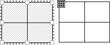
Allows you to organize data in tabular form. Properties:
- "table":
Columns- number of columns. - "table":
Rows- number of rows. - "table":
Cells horizontal layout- behavior of cells when the width is changed by the component: "fit" (dynamically change the width of cells, fitting in width), "left" (cells do not change in width and bound to the left), "right" (cells do not resize and are bound to the right). - "table":
Cells vertical layout- similar toCells horizontal layout, but for the vertical derection.
The TableCell component acts as a cell in the table, where you can put some of your own components, for example, a text label. Clicking on a table cell selects the cell component. In order to select the entire table when it is not selected, you can use the special handle in the upper left corner of the table, or select it in the structure.