Form designer: Date input visual component
The Date input component is used to enter dates by the user.
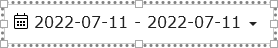
The component allows the user to select a date or range of dates from a dropdown list or calendars. The selected dates are hold in properties of this component. The component displays texts in the selected user language. Similarly, time oprations is performed in the time zone selected within the user profile.
Using the logic designer, the selected dates can be read and applied in further logic, for example to:
- initiate the creation of a report for the specified date range
- get and display tag data for the specified date
- set HistoricChart components to display data on selected dates
Properties of the DateInput component
The main properties of the component are collected in the "date" group
- "date".
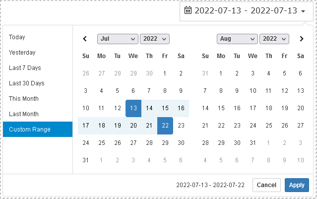
Default selection- selected default dates that the component will display when creating the form. Possible options:- "Today"
- "Yesterday"
- "Last 7 Days"
- "Last 30 Days"
- "This Month"
- "Last Month"
- "date".
Auto apply- after selecting the dates, you will need to click the "apply" button. If this property is set to "true", then the confirmation buttons will not be visible and the date selection window will be hidden immediately after the user selects dates - "date".
Single datepicker- if "true" then only one calendar will be shown to select one date, otherwise two calendars will be shown and the date range can be selected - "date".
Show dropdowns- if "true" then when selecting a date, dropdown lists will be available for selecting years and months - "date".
Show week numbers- if "true" then when selecting a date in the calendar, week numbers will be shown - "date".
Show ISO week number- show ISO week numbers in the calendar - "date".
Date range limit- restriction on the maximum allowable range of selected dates in days - "date".
Opens- Whether the datepicker will be left-aligned, right-aligned, or centered below the HTML element its attached to. - "date".
Drops- Whether the picker will open "up" or "down" - "date".
Format- display date format - "date".
Time picker- whether to show elements for time picker
Properties of subgroup "time" - time selection:
- "date"."time".
Time picker 24 hours- 24 hours a day or 12 hours + AP/PM - "date"."time".
Time picker increment- step to increase the selection of minutes in the dropdown list - "date"."time".
Time picker seconds- whether to display seconds when picking time
In the "font" property group, you can change the font of the component.
The selected dates gets into the "date".Start date and "date".End date properties
An example of using the Date input properties can be found in the note Synchronization of the Date input and several Historic Charts components