Form designer: Analogue meter, Arc meter, Bar meter visual components
Components from the "meters" group of the palette are intended for displaying analog values in a graphical form
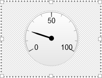
- "Analogue meter" displays values as a meter with pointer
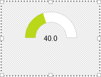
- "Arc meter" displays values in the form of a fillable arc
- "Bar meter" displays values as a horizontal or vertical progress bar
In the form designer, you can immediately set the "gauge".Value property and see the result. In order for the component to display not a static value, but a changing value coming from the data source, each of these components has [dynamic properties] (formdesignerdynamicprops), where you can set the "Value" property dynamically when some tag value changes.
Basic component properties
The main properties of the components are in the "gauge" group:
- "gauge".
Value- sets the value that will be displayed in the component - "gauge".
Min- minimum value for component gauge - "gauge".
Max- maximum value for component gauge - "gauge".
Animation duration- animation duration when arrow moves / filling the up scale to a new value (in ms)
Specific properties for "Analogue meter"
The "pointer" settings group combines the properties for setting up the display of the "pointer" of the device:
- "pointer".
Radius- arrow radius (total length) - "pointer".
Back color- arrow background color - "pointer".
Border color- arrow border color - "pointer".
Border width- arrow border width - "pointer".
Base width- thickness of the main part of the arrow - "pointer".
Top width- pointer narrowing thickness - "pointer".
Base length- the length of the main part of the arrow - "pointer".
Rear length- the length of the rear part of the arrow (beyond the axis of rotation, in percent) - "pointer".
Pivot back color- arrow rotation axis color - "pointer".
Pivot radius- radius of arrow rotation axis
Specific properties for "Arc meter"
- "gauge".
Rounded- if "true", the arc will be filled with rounded edges - "gauge".
Inner radius- inner radius of gauge - "gauge".
Outer radius- outer radius of gauge
Specific properties for "Analogue meter" and "Arc meter"
- "gauge".
Start angle- start angle of the scale (in degrees) - "gauge".
End angle- end angle of the scale (in degrees)
The properties in the "background" group allows to set the background display options:
- "background".
Type- "gradient" - standard gradient or "color" - "background".
Color- background color, if "color" type is selected - "background".
Shape- background shape, - either "circle" or "arc" - "background".
Outer radius- outer radius of the background (in percent) - "background".
Inner radius- inner radius of the background (in percent) - "background".
Border color- background border color - "background".
Border width- thickness of the background border
Specific properties for "Bar meter" and "Arc meter"
Group of properties "fill colors" - allows you to set the gradient filling of the current value for ArcMeter and BarMeter depending on the value:
- "fill colors".
Fill colors num- parameter sets the number of "fill colors"."color" settings groups. Up to 8 groups can be specified. The following properties can be set for each group: - "fill colors"."color N".
Color- sets the color for the position - "fill colors"."color N".
Position- a fractional number from 0 to 1 that defines the value on the scale, between its minimum and maximum values - if the value displayed by the component approaches it, then the filling of the area with the value will approach to the specified color.
Specific properties for "Bar meter"
- "gauge".
Direction- orientation either "horizontal" or "vertical" - "gauge".
Border radius- border radius - "gauge".
Border color- border color - "gauge".
Border width- border width
Other common properties
Group of properties "bands" - combines settings for coloring sections of the background of the scale:
- "bands".
Plot bands num- parameter sets the number of groups of 'band' settings. Up to 8 groups can be specified.
Parameters of each group:
- "bands"."band N".
Border color- band border color - "bands"."band N".
Border width- thickness of the band border - "bands"."band N".
Color- band background color - "bands"."band N".
From- value of the beginning of the scale range - "bands"."band N".
To- end value of the scale range
For ArcMeter and AnalogueMeter, a few more properties are available in this group:
- "bands"."band N".
Outer radius- outer radius of the area - "bands"."band N".
Thickness- area thickness
"title" property group - title properties above the device
- "title".
Title- title text - "title".
Horizontal align- horizontal alignment of title text: left, center, right - "title".
Vertical align- vertical alignment of the title text: top, middle, bottom - "title"."font" - title font settings
The "ticks" property group defines display parameters for ticks. Tick can be major and minor.
- "ticks".
Color- color for drawing ticks - "ticks".
Interval mode- Sets the interval mode for drawing tick marks, either "auto" or "manual" - "ticks".
Interval- If the manual interval mode for drawing ticks is selected, then this parameter sets the interval of ticks - "ticks".
Width- ticks width - "ticks".
Length- length of ticks - "ticks".
Line width- thickness of the line along which ticks are drawn - "ticks".
Line color- color of the line along which ticks are drawn
the same parameters in this group, with the prefix "Minor" in the properties name - refer to the rendering of minor ticks.
The "tick labels" property group sets the display options for the labels of the values of the main tick marks on the scale:
- "ticks labels".
Enabled- allows "true" or disables "false" display of axis tick values - "ticks labels".
Align- aligns labels to the "left", "right" or "center" - "ticks labels".
Position- position of labels - "inside", or "outside" the scale - "ticks labels".
Extra distance- sets the label offset away from the edge of the scale by the specified value (pixels) - "ticks labels".
Format- allows you to set the formatting for displaying the values of the main ticks of the axis. The default is empty, you can specify for example {value:.1f} - for a fixed output with 1 decimal place - "ticks labels".
Rotation- "auto" - labels will be rotated automatically or "manual" - "ticks labels".
Rotation angle- allows you to rotate the labels by the specified angle if the manual rotation mode is selected (in degrees). - "ticks labels"."font" - font settings for tick labels
The group of properties "data labels" sets the parameters for displaying the label with the current value in digital form:
- "data labels".
Enabled- allows "true" or disables "false" display of the current value - "data labels".
Align- left, center or right - horizontal alignment - "data labels".
Vertical align- vertical alignment - "data labels".
Background color- background color of the label with the current value - "data labels".
Border color- label frame color with text - "data labels".
Border radius- number-percentage of roundness of the frame with the label - "data labels".
Color- text font color with values - "data labels".
Format- output format. e.g. {y:.2f} - displays 2 decimal places - "data labels".
X- extra horizontal label offset (in pixels) - "data labels".
Y- extra vertical label offset (in pixels) - "data labels"."font" - label font settings with value